Pivot table widget
Pivot table widget
The pivot table widget is one of the core functions in data analysis tools. It supports multi-dimensional grouping and flexible summarization to quickly generate structured statistical reports. Whether it's sales data statistics, inventory analysis, or operational indicator monitoring, data aggregation calculations (such as summation, average, maximum value, minimum value, etc.) can be achieved through simple configuration and displayed in an intuitive cross-tabular form.
Core Functions
- Multi-dimensional grouping: Support grouping data by row dimension (Row) and column dimension (Column)
- Diverse statistics: Provide multiple aggregation methods such as sum (Sum), average (Average), maximum value (Max), and minimum value (Min).
Usage steps
- Create a dashboard
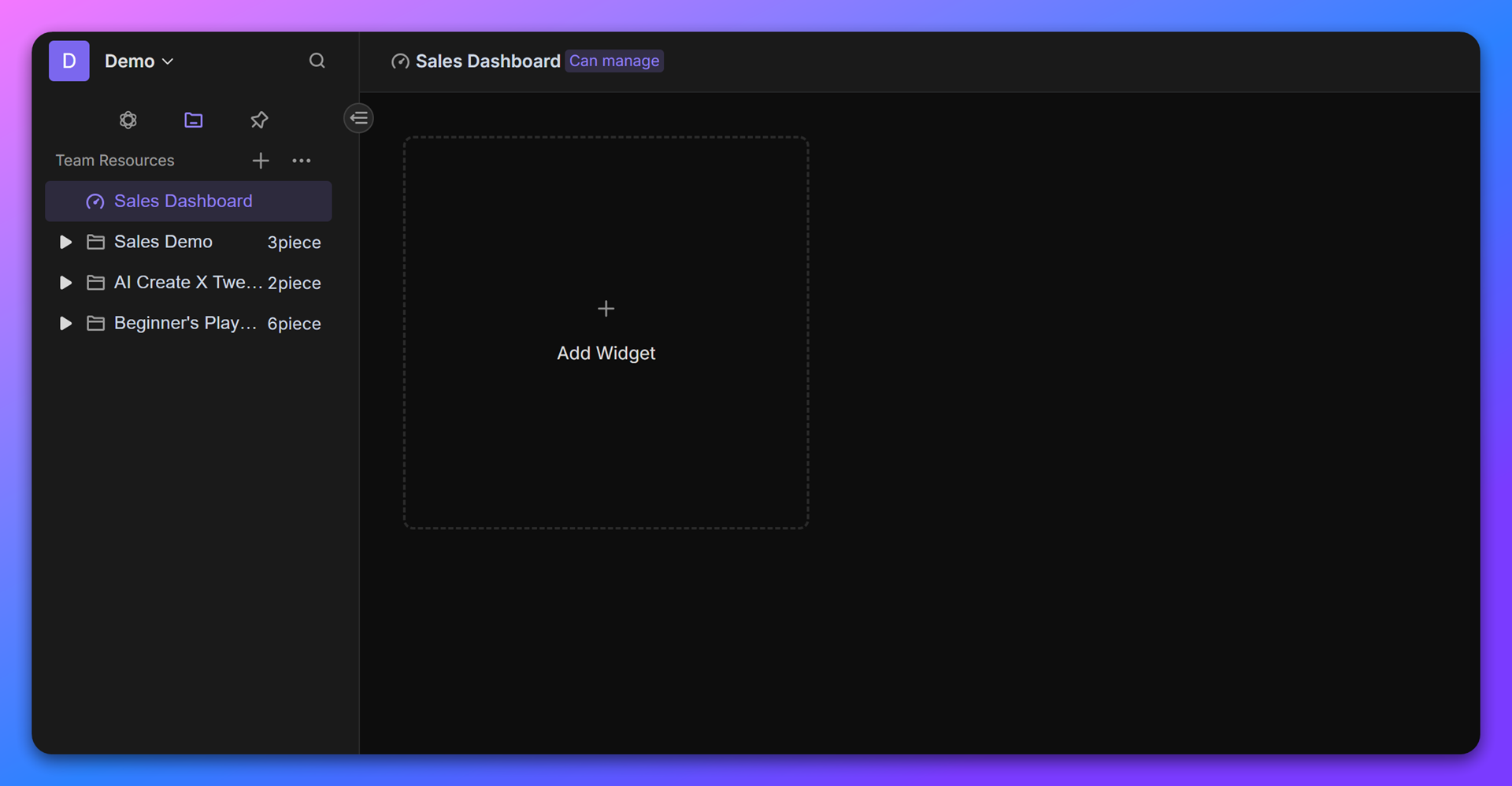
Enter the space and create a new dashboard. Click "+ Add widget" in the toolbar and select "Pivot table".
- Configure data source
- In the widget configuration interface, specify the database (Database) and data view (View) that need to be analyzed.
- Set row and column dimensions
- Row Dimension: Usually, a first-level classification field (such as "sales platform") is placed. Data will be grouped vertically according to this field.
- Column Dimension: Usually, a second-level classification field (such as "SKU") is placed. Data will be grouped horizontally according to this field.
Example: If you need to view the sales situation of each "SKU" by "sales platform", then:
- Row Dimension:
sales platform- Column Dimension:
SKU
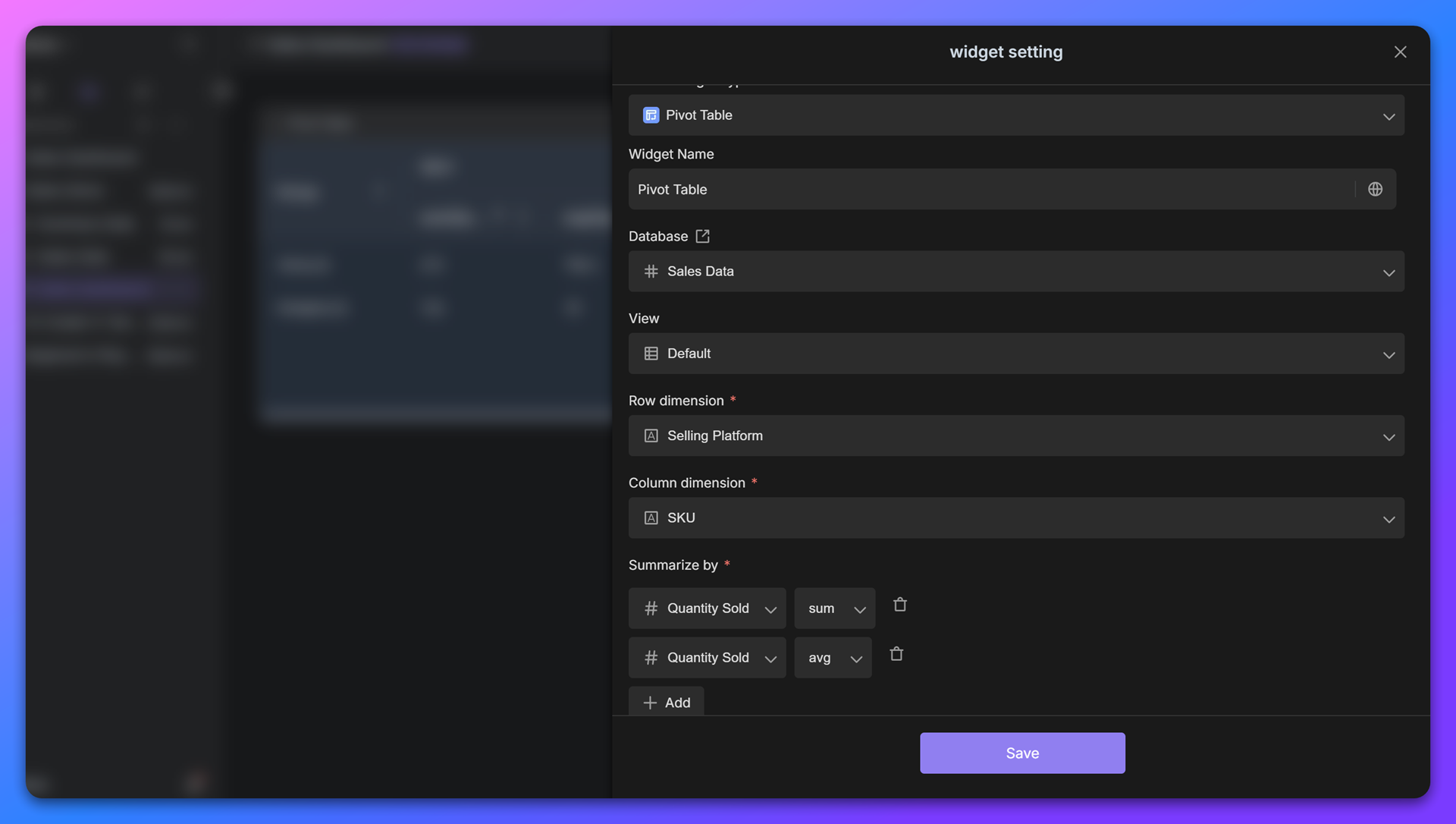
- Add summary indicators
In "Summary by", configure the numerical fields and statistical methods that need to be calculated:
- Click "+ Add" and select the target numerical field (such as "sales volume").
- Set the statistical method:
- Sum: summation
- Average: average
- Max: maximum
- Min: minimum
Example: If you need to count the total sales volume of each SKU under each platform, then add the indicator:
Quantity Sold→ Sum
- Generate and save
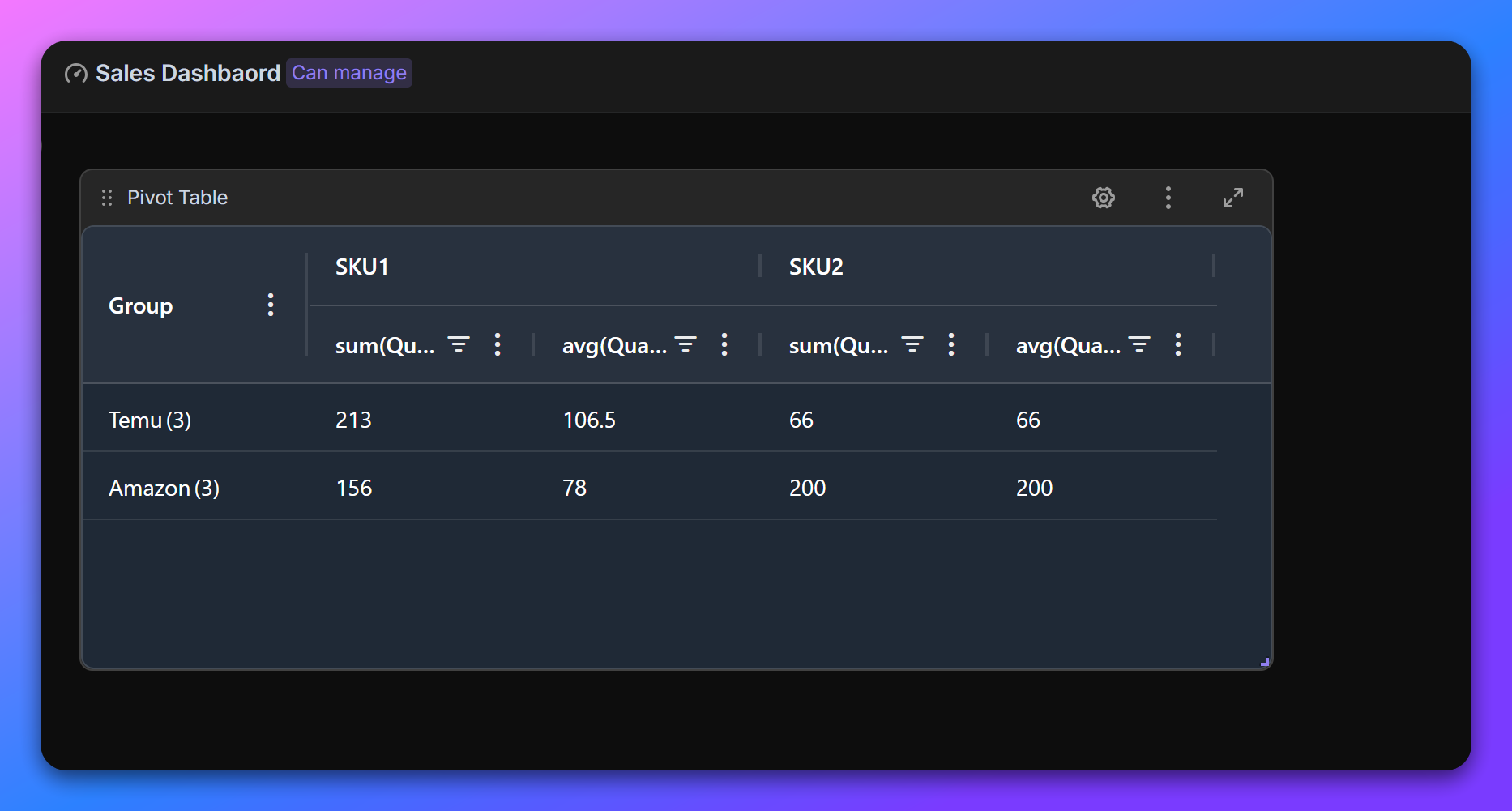
After completing the configuration, click "Save" and the system will automatically generate a pivot table. The report will display data in a cross form. For example:
- Each row represents a sales platform, each column represents an SKU, and the corresponding summary value (such as total sales volume) is displayed in the cell.
Application scenario example
Sales data statistics
Suppose the original data contains:
- Row dimension: sales platforms (Temu, Amazon, TikTok)
- Column dimension: SKU (Product A, Product B, Product C)
- Summary indicator: quantity sold (summed)
After configuration is completed, the pivot table will present the following structure:
Sales platform \ SKU | Product A | Product B | Product C |
Temu | 150 | 200 | 120 |
Amazon | 90 | 180 | 75 |
Tiktok | 210 | 150 | 95 |
Advanced skills
- Multiple indicator overlay: Add the same field repeatedly in "Summary by" and select different statistical methods (such as calculating "total sales volume" and "average sales volume" simultaneously).
- Dimension adjustment: If more detailed analysis is needed, multi-level row/column dimensions can be added (for example, "sales platform" + "region").
- Sorting and filtering: Click on the table header to sort the data, or focus on key information through the filter on the right.
Recommend AI Automation Templates